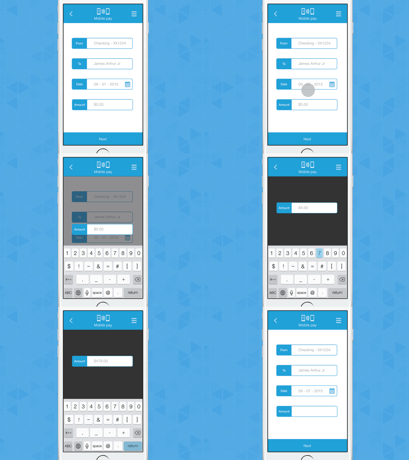
New way to deal with inputs
I wasn't happy with the way inputs are currently used on most applications: When a user clicks an input, the whole screen would scroll up to show the focused input above the keyboard.
Problems:
- disrupts the flow (put the input in a new screen)
- disturbs the user (move the whole screen)
- you might not even see the input you are trying to fill in
Solution:
I imagined a better way to do it, by highlighting the focused input and moving only this element in the middle of the viewport.
Results:
- it doesn't disturb the user
- it make the user focus on the input
- it gives more real estate to show error messages or information text about the action being done
it is also a great way to deal with inputs on tablet or larger screen as it allows the rest of the UI to stay in place.
Let me know what you think!


