Packaging Design - Cura Your Daily Supplement
Cura is a supplements subscription service fully customised to your needs. We tailor each dose to the vitamins your body requires based on your DNA, so taking the supplements you need has never been easier.
The name Cura–meaning to care for–is based on the Roman goddess who created the first human. We started Cura to help those who are unsure what kinds of supplements to take and how much in as simple a process as possible. The dandelion featured in the logo is a symbol of growth, hope and healing. Just as the dandelion is known for its various medicinal properties, we at Cura want to ensure you get all the vitamins you need with the best individually-curated supplements.
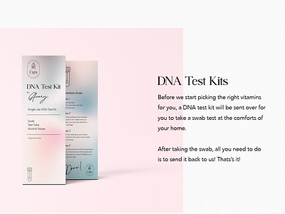
The gradient colours on the packaging give motion and fluidity to the design–it is ever-changing. Cura takes great care to provide you with the necessary nutrients according to your DNA. That is why each monthly supplements package may be different. The salmon pink is vibrant and like the sunrise giving the users a visual guide that supplements in that box are for the morning. The light blue/purple tones are relaxing and for winding down to indicate night use. On the labels, the different types of vitamins in each sachet is listed as well, so you’ll always know what kind of vitamins you’re consuming.
