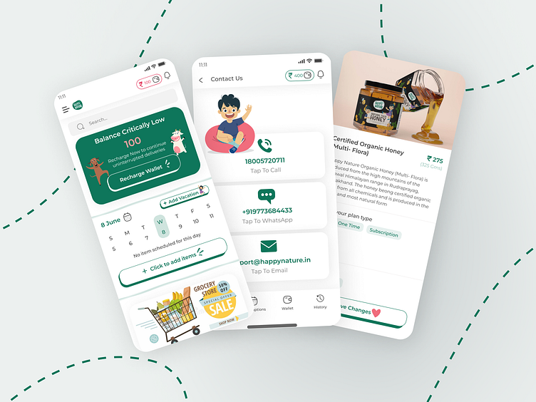
App Design for an E-Commerce Grocery Delivery App
Happy Nature is a daily grocery delivery app that mainly operates out of Delhi, India. They have very high-quality daily groceries like milk, eggs, bread etc and they do deliveries early in the morning and generally work on a Subscription basis and trials are a very important part of their business. When the founders approached me they were facing a problem with differentiation as the market that they are in is pretty overcrowded. They had an app and web app out in the market but there were some UX issues that didn't let the user have the best experience- especially in booking trails which is an entry point for anyone to start buying from them. Their UI also wasn't the best and had a long way to go.
After knowing their pain point, I suggested them changes like changing pitch blacks for copy to a shade of grey as that is easier on the eyes and changing the font from Ariel being used before to Montserrat to make the whole app feel more easy to read and friendly. I also added their beautiful illustration elements to different parts of the app and integrated their brand identity to each and every screen of the app. The primary green that is used in the app is their brand colour and so that was retained in the app.
Colours used in the app are:- Primary Green- 0E765B, and Primary Typography- 464646 The rest of the colours come from the illustrations and product packaging.
Font used is Montserrat.
After the revamp- the founders told me that they have been getting awesome reviews on the app's UI and in terms of UX users are having a seamless experience and that their trails have increased a considerable amount.
Press "L" if you like the design and let me know what you think


