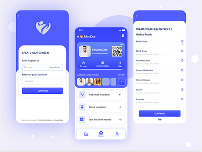
Healthcare Mobile App UI
Healthcare Mobile App UI
.................................................................................................
To improve the quality of life by transforming the way healthcare and wellbeing products and solutions are delivered. Aim is to enhance the quality and affordability by deploying next-generation Data-Driven care protocols
Problem:
The UI feels old when compared to other healthcare apps.
The home screen is clustered by actions or icons that are barely used.
Key features are not easily accessible all screens.
Solution:
I took a minimalistic design approach and the whole design approach and the whole design process started from hand draw sketch down to high fidelity while trying not to deviate from the main concept as much as I can and I’ll only presenting the main UI screens of the mobile application.
Share some feedback & Press 'L' if you like this shot :)
