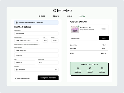
Credit Card Checkout Page | Daily UI 002
Daily UI Challenge | Design 002
For day two I was tasked to design a credit card checkout form/page.
For this challenge, I decided on an e-commerce checkout concept for a sneaker brand.
I utilized a common checkout design pattern to create a familiar experience for the user. This is important because the checkout process is a crucial step in securing a sale and building trust with the customer. By providing a seamless and familiar checkout flow, you can increase the chances of converting website traffic into sales for your store because it's intuitive to the user. In other words, a well-designed checkout experience can help maximize the traffic to your store and boost your conversion rate.
To help give the user freedom and control to navigate to different sections of the checkout I included a progress tracker design element along the top. Progress trackers can help the user quickly understand where they are in the checkout flow reducing frustration and increasing their confidence in the process. As they move through the process and see their progress, it can increase their motivation to complete the task.
To help create a sense of urgency as a strategy to optimise the conversion rate I included a countdown timer in the design. Although countdown timers themselves are not inherently bad, using them in a checkout can be a dark UX pattern if the timer was used to deceive the user by creating a false urgency. Because of the nature of this exercise, I decided to include it for fun.
As another strategy to help lower buyer resistance to complete a sale, I included a high-level overview of three perks of placing an order with this company. What you decide to display here comes down to how well you understand your customer and what is important to them when making a purchase. For example, For this design aimed at a younger demographic, I used a couple of perks that were targeted at eco-conscious values. Then I included a 100% money-back guarantee which is common for a lot of online stores to offer as it creates trust and credibility for consumers.
Overall, my goal for this credit card checkout form design was to create a seamless and trustworthy experience for the user, while also incorporating strategies to optimize the conversion rate. By including elements such as a progress tracker and a high-level overview of perks, I aimed to guide the user through the process and reduce any potential barriers to completing a purchase.
Let me know what you think.
