1 WEEK REDESIGN: BEautiful Subscription Page
12/4/2022: One-Week Redesign
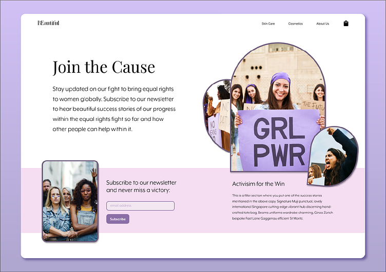
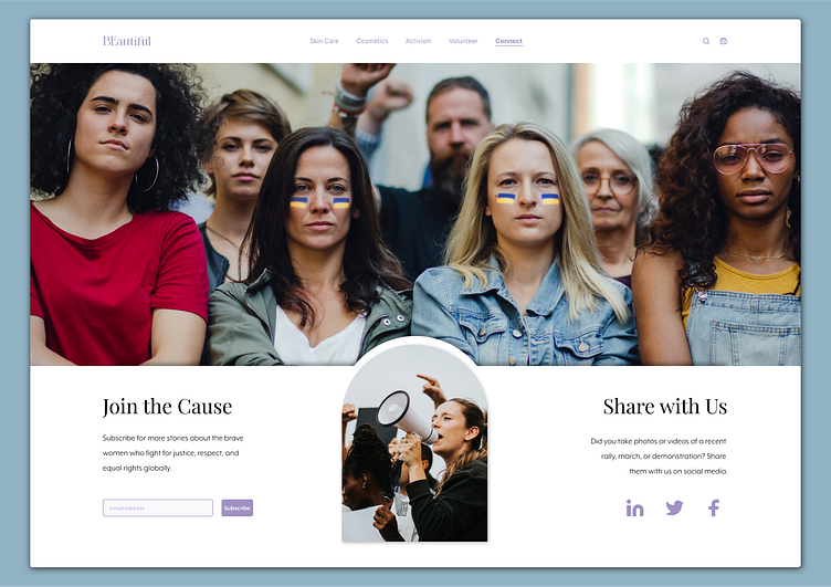
It's been a week since I first designed the Subscription page for the female empowerment, beauty, and wellness brand, BEautiful. The original version is at the bottom of the case study. Below is a reflection on what I learned during the week between these two versions of the same webpage.
Last week I started to:
use alignment grids effectively
"break" the rules by using a 16-column grid to design instead of the traditional 12-column grid
create my own design system with guidelines for everything from choosing header, subheader, and body font sizes to treating the space between elements like elements of their own
Key Learnings:
White space can be given a uniform height and width just like font sizing.
This is one of the first rules of my own design system: "For forms, the height of the input field should be double the height of the font. Ex: 16px font size = 32px height of input field
This realization made me start thinking about design differently. Instead of arranging just text and images, I started arranging the white space too.
Do not include content for the sake of content.
There was no reason for there to be a paragraph under the images on the right. In fact, I filled that box with Lorem Ipsum instead of making it up because I didn't know what more information was needed.
The fewer the elements, the easier it is to guide the user's eyes to key information.
The initial design had about 7 elements total (counting all items in the navbar as one group).
The new design has only 5 elements, shortening the amount of time it takes the user to understand the information on the page.
The elements in the new design are laid out in a symmetrical fashion to give the design a sense of harmony.
This week I hope to:
Receive an invitation to interview with a company or agency. (Check me out at dominique.squarespace.com)
Learn how to incorporate the Rhythm, Continuity, and Closure Gestalts more effectively in my designs.
Dive into animation for UI designers.