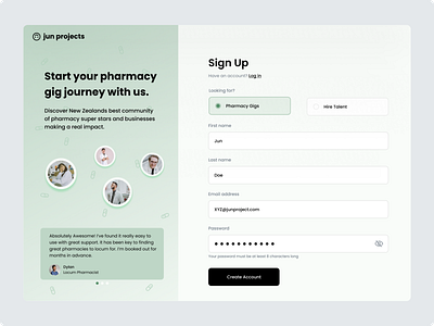
Sign Up Page | Daily UI 001
Daily UI Challenge | Day 001
I was tasked to design a sign-up page. I approached this challenge with a Pharmacy job board concept in mind.
For the visuals, I drew inspo from the historical colour for pharmacy, green while aiming to achieve a clean minimal aesthetic.
I enjoyed adding social proofing elements to the page through the use of images of people and the testimonials carousel seen on the left-hand column of the design.
A couple of simple features I included to avoid annoying UX issues with password creation were:
1) Displaying password requirements under the input field
2) giving the user the option to view their password.
These small details can be easily missed when designing a sign-up page but have a big impact on the overall user experience for password creation.
I used the button text 'Create Account' instead of something vague such as 'Continue'. I believe this gives the user more clarity about the action they are taking and gives the button more value.
Another consideration made for the user was the ability to switch between logging in and signing up. An easy-to-find link under the sign-up heading was included in the design.
A feature that didn't make it into this design but could be a great addition to any sign-up form is the ability for single sign on. Providing single sign on options using your Google or Facebook account simplifies the signup step for the user and removes the hassle of coming up with another password to remember.
I feel there could be improvements made with the font weighting for some sections of the design. Selecting fonts and deciding on weights is an area in that I would like to become stronger.
However, with the time constraints of completing this challenge within a 1.5-2 hour period from idea to execution, I was happy with how it turned out.
Let me know your thoughts.
