SlayBees | Brand Design
SlayBees is a youth mentorship group that focuses on providing a safe haven for young people, a place where they can forge personal connections and find strength in constructing modern ideas.
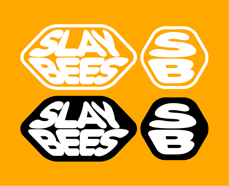
The whole shtick
Taking inspiration from current care-free attitude to graphic design (especially within youth, perfect for this project), I wanted to use bold, stretchy type that'd morph and take the shape of whatever encased it. SlayBees feeds perfectly into that messy look that comes with the challenging of modern standards and guidelines.
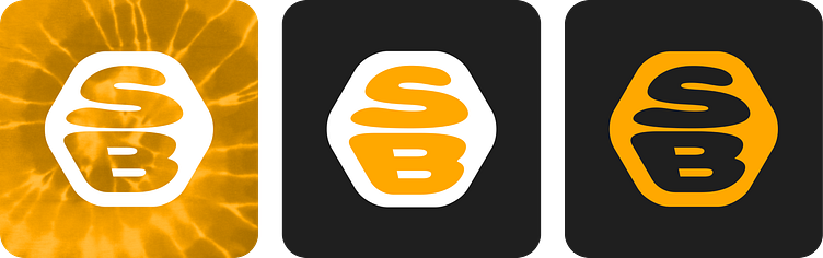
I feel like the logomark represents this best, the morphed type creating a playful icon that felt right at home with the brand. When creating it, I also pictured it for use on pin-badges and other fun mediums.
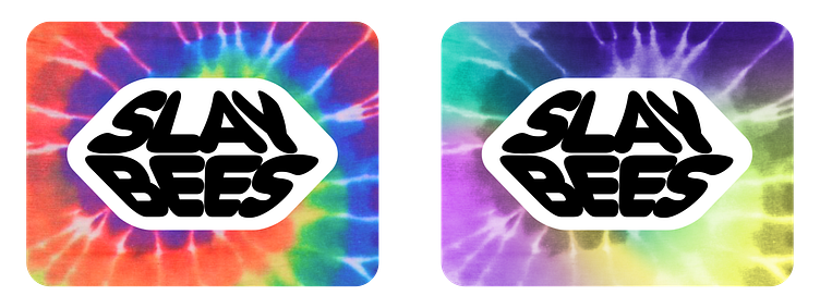
Tie-dye!
Speaking about going against modern standards, I ran with the idea of using tie-dye for variations of the assets. Tie-dye represents organic randomness in connections and a revolt from modern technology. Sara asked for some pride-themed assets, so outside of the SlayBees orange I created a version that was completely rainbow, and one that was very mardi-gras-like (as per her request)!
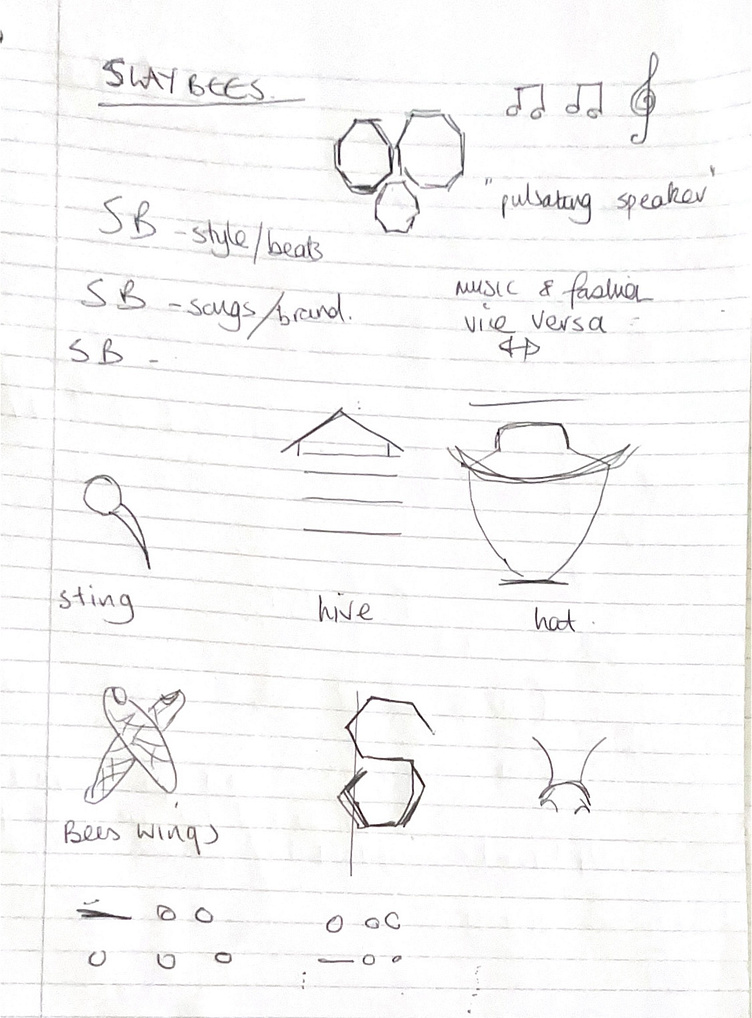
Starting Ideas