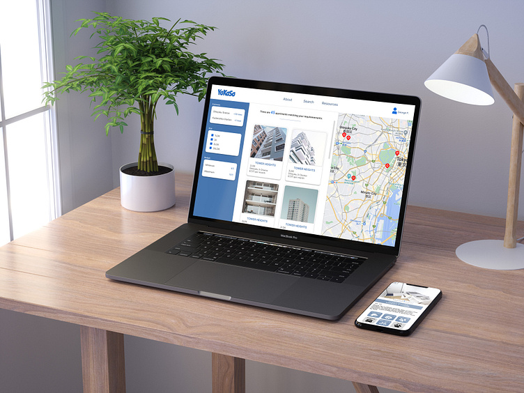
YoKoSo: Foreigner-Friendly Apartment Search Service
For the final assignment of Google's UI UX Design Professional certification, I was tasked to create an app and responsive website that fit the theme of "Social Good".
As a foreign resident in Japan, I know how complex (and disheartening) the apartment search process can be. For that reason, I decided to design a service that would make it easier and faster for other international residents to find their new home.
Researching The Market
As a foreigner in Japan, I knew from personal experience that searching for an apartment can be a difficult process, but after reading an article that claimed that less than 20% of real estate agencies in the country will consider foreign tenants, I decided to put more research into the hurdles and complexities involved in an international resident's search for a home.
Speaking with other foreign residents and looking at popular forums online, I identified that there were four main 'pain points' complicating the apartment search process here in Japan: language barriers, confusing contracts, difficulty securing a guarantor, and general bias/misconceptions that exist in regards to other nationalities and cultures.
For my user personas, I decided to focus on two different experiences that had repeatedly come up during my research: people overseas looking to secure a home before moving to Japan, and a person already in Japan who, despite speaking Japanese, finds that red-tape and misconceptions overcomplicate and prolong the process.
Wireframes, Lo-Fi Prototypes and User Tests
As the assignment required the creation of a mobile-native application prior to designing the responsive website, I decided to focus on designing and testing the app as my main priority.
After creating a working lo-fi prototype, I asked a selection of foreigners in Japan to complete some basic tasks and share their feedback on my design.
Whilst feedback was generally positive and enthusiastic, there were several issues that were raised during testing, particularly in terms of the ability to share an apartment listing with a partner/friend outside of the app via SNS, and the ease with which an apartment viewing could be booked (and cancelled if necessary).
From the feedback provided, I was able to generate several insights that could be translated into design improvements prior to proceeding to the high-fidelity mockup stage.
Final Designs and Thoughts
The final app design was greatly improved by the points and ideas shared by users during the usability testing stage, which really highlighted for me the importance of getting feedback from the target demographic during the design process.
As a designer, it's very easy to look at your own designs through a rose-coloured lens and miss the inadequate features or issues that others would instantly identify. It's also far too easy to declare your own work "intuitive", when in fact real users may struggle to interact and fully make use of the product.
The theme of this project was "social good", and I really enjoyed the challenge of coming up with an idea that not only improved the lives/experiences of others, but also one that opened my eyes to the different needs and opinions that can exist within one target user group or demographic.


