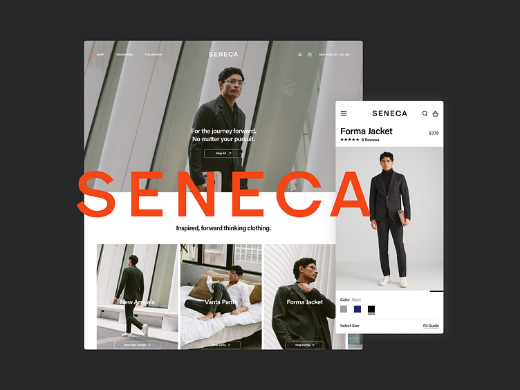
E-commerce redesign for NYC-based menswear apparel label
Seneca is a New York City-based high-end menswear brand with a backbone and a strong set of values. What they needed was a comprehensive Shopify e-commerce platform redesign that would drive conversions, increase traffic, and ensure a premium shopping experience.
APPROACH
Our goal was to increase conversions and make an already existing website more accessible and pleasant to use on mobile.
SCOPE
Unlike many other projects we’ve done, instead of building a new website, we’ve overhauled the interface of an already existing page. Our UX Audit & Strategy process incorporated thorough website research. Once we agreed on what works, we sat down to UX- and UI-related work, both on the front- and back-end.
VALUE DELIVERED
The Seneca team was kind enough to report back their findings after deploying the website. During the first month, the company more than doubled its conversion rates, fulfilling one of the most important goals of the whole project.
We worked with a client-prepared website mock-up, not only realizing their concepts but improving them with user experience-enhancing features.
The final product is a modern, clean-looking, custom e-commerce website that captures the user’s attention and encourages them to explore the brand’s offer.
Designers: Anna Trzcińska, Karolina Ignaszak | Developers: Marcin Owczarzak, Wojciech Kalbaczyk | Project Manager: Anna Michałowicz | Quality Assurance: Agata Gałka
Let’s shape & build your next digital product together:
Message us at hello@adchitects.co or visit our website!
Did you like our shot?
Press L to show us your support!


