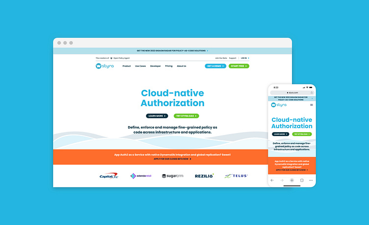
Styra Website Update
This project was the collaborative outcome between the design and marketing teams at Styra and myself and the creative team at Flickerbox. The old site was dated and in need of a refreshed look and feel so we created modern elements and layouts, along with the existing brand guidelines and assets to create a whole new website that everyone could be excited about. Bold and colorful, the new approach to Styra shows off a friendly and approachable security product. Check out the new site here: https://www.styra.com/
Initial Page Layouts
Proposed options for the homepage hero graphic
Final Page Layouts
Assorted Modules and Graphics
More by Jeffrey Boese View profile
Like


