Veriato: Corporate Rebrand
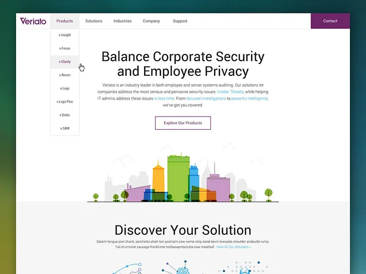
New corporate homepage design for a rebrand launching later this year. This project has had so many set backs and delays outside of my control, but this is where I left off with the revision.
Originally, this had a side navigation as well as a top. We abandoned the side nav to keep it simple. Large headlines, bright colors and simplicity remain. I really enjoy this color pallet and cleanliness. I hope I will see the day it comes to completion.
Let me know what you all think.
Full view here: http://on.be.net/1BXZUJC
More by Aaron View profile
Like
