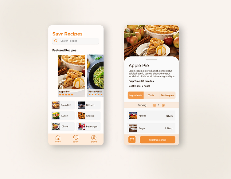
Savr Recipes - the cooking experience designed stress-free
Savr Recipes is a mobile cooking app with hundreds of diverse and quality recipes and cooking tips for at-home chefs.
Timeline: November 2022
Responsibilities: UX UI
Tools: Figma
Overview
The Savr Recipes app is a valuable resource for at-home chefs to find recipes at all experience levels. Many users enjoy using the app to learn new recipes and save their favorite meals. Using the Google Ventures Design Sprint Methodology, in five days I aimed to implement new features on the Savr Recipes app to add more structure and reassurance while these chefs are cooking.
The Solution
My goal in this Google Ventures 5-day design sprint is to implement new features that:
1. Prepares ingredients, tools, and unique techniques a head of time before users start cooking
2. Creates efficiency in clean up and cooking tasks by adding a prepping phase to recipes
3. Provides visuals during the cooking process to let users know they are on the right track
01. What is making the Savr cooking process stressful and mapping a better experience
I started off this sprint noting frustrations each user experienced while cooking with Savr Recipes. It was clear that users enjoyed Savr for the diversity and quality of their recipes but it was cooking experience that users expressed all of their pain points. User pain points included:
Looking for cookware during the cooking process and not being able to minimize dishes
Uncertainty if users are “on the right track” and if their food looks right
Cooking techniques that are unclear while cooking and having to pause to Google search
Wishing there were suggestions to increase efficiency. User suggestions included proceeding to other steps while meat is cooking or prepping ingredients like cutting vegetable before mixing everything
After analyzing each pain point, I created possible end-to-end user experience maps that would solve each individual’s pain point. I built each map off of each other to ultimately create the user experience that would address all user issues. This map created the foundation of my design moving forward.
02. Finding inspiration, sketching possible solutions, selecting screens that fit my user map
For Day 2, since I am the individual contributor for this sprint, I did a modified lightning demo where I did my own research for how other cooking apps organize their recipes. I was inspired by how certain apps aesthetically display their recipes and also how apps organized information into ingredients, tools, and directions.
I then did a Crazy 8s Sketch exercise where in 8 minutes I quickly tried out a variety of screens by sketching possible solutions with inspiration from my lightning demo research. I selected my critical screens by picking sketches that grouped ingredients, tools, techniques, prep steps, and cooking steps very clearly and concisely while also following my user experience map.
03. Creating screens of a streamlined cooking flow
After creating my critical screens, I sketched out what the journey would look like with a storyboard following my end-to-end user experience map.
Design decisions I made to address user issues included:
Adding a lot of visuals to all categories to create reassurance for users
Providing a tools section so users prepare cookware before hand and minimize dishes
Providing a cooking techniques section before the recipe so that users aren’t surprised by intimidating steps during the cooking process
Having a prepping section in the recipe to increase efficiency while cooking
Providing prep and cook time for accurate recipe timing
04. Prototyping unique and on brand screens
I then prototyped the final designs from my storyboard to create the following screens using Figma. I added a lot of design inspiration from my previous app research like the display of the picture when you first open the recipe and the toggle buttons to separate the information for ingredients, tools, and techniques. From the Savr Recipes logo, I also decided to use different variations of the orange through out different elements in my design instead of finding a secondary color because I thought the orange was unique and on brand for Savr Recipes.
05. Confirming that Savr's new features are appreciated by users
For the final day of this design sprint, I did 5 user interviews in person and online via Microsoft Teams. I screened for users that regularly research and follow cooking recipes online and asked questions related to their deciding factors when comparing recipes and their thoughts when following a recipe using the Savr app. After the interviews, I found that users showed a lot of positivity to the new features on the Savr Recipes app. Users intuitively were able to finish tasks and appreciated all of the preparation information for a smooth cooking process. The few critical feedback included an interactive element to check off recipe steps and an onboarding to show users around for the first time.
Conclusion
After testing, the added features to the Savr Recipes mobile app proved to be intuitive and appreciated by users that regularly use online resources to help them cook new meals. These new features addressed issues around uncertainty during the cooking process, and lack of information on cookware, prepping steps, and advanced cooking techniques which all lead to inefficiency while cooking. In the future, I would like to experiment with adding more interactive elements and build out an onboarding process to make the app even easier for first time users.
In conclusion, this 5-day Google Ventures challenge was my first experience with a design sprint. I really enjoyed working on this fast paced design challenge independently but I am looking forward to collaborating on a sprint with my future design team.


