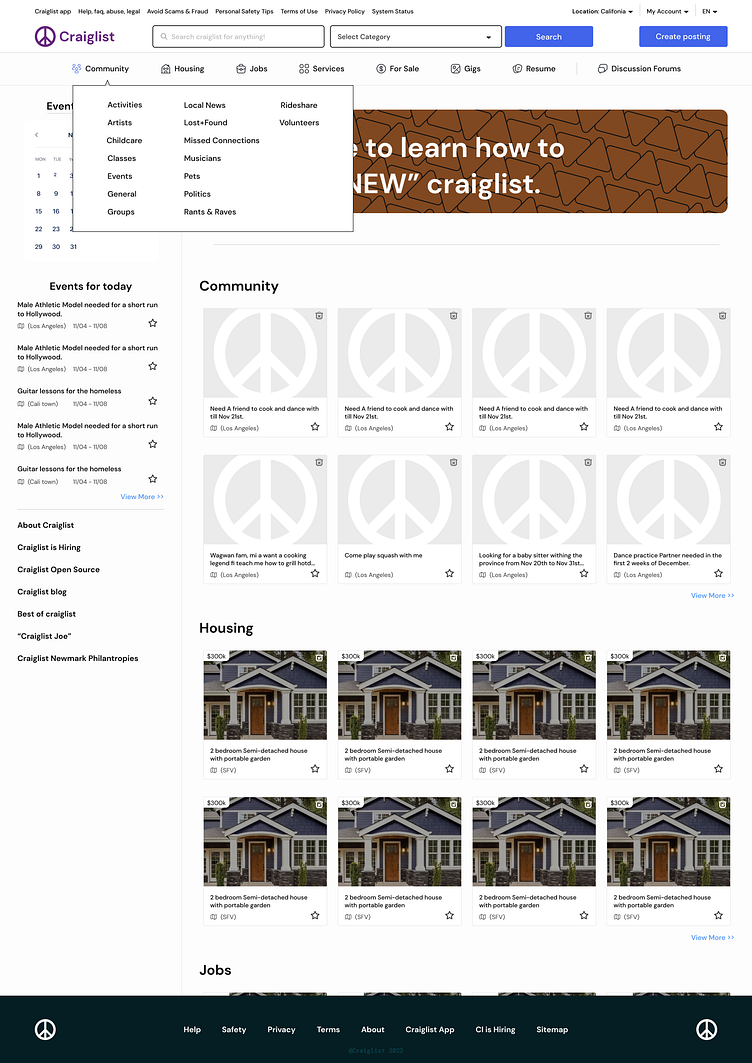
Hover interaction for tabs on the cragislist redesign
I did a redesign of the popular craigslist platform, while making sure that the old flow wasn't broken. Users will find that the top navigation is still familiar and for users who may be having difficulties, a link to a tutorial video on how to use the platform is available.
The goal of the redesign was to improve navigation through the platform, as well as using colour, text size and proper icon usage to point users to the place they want to go to.
The second goal was to improve the aesthetic of the platform.
More by Adeola Destiny Adedoyin (@destinyspoke) View profile
Like
