Case Study: Kids Health Website
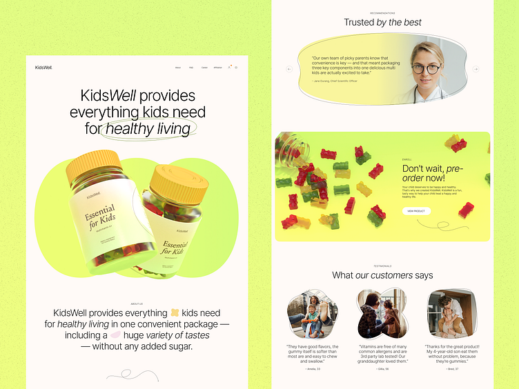
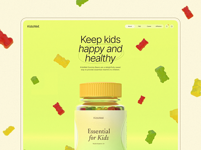
Catch the vibes of healthy energy of childhood with our web design project: take a deeper look at the bright website for the service providing diverse and comprehensive support to make kids' life healthy.
Vibrant colors, readable typography, solid visual hierarchy, neat minor graphics, and well-balanced combination of photo content and custom 3D images make the pages informative and attractive, functional and emotional.
Also, welcome to check:
• the diverse collection of our design case studies
• the big set of nifty app design concepts
• the UX practices of product page design
• the guide into the basic elements of a web page
• the tips on how to apply web animation
• the types of interactive content amplifying user engagement
—
Tubik | Tubik Blog | Behance | Instagram | Twitter | Facebook


