Archer
If you're my age you remember when Archer first came out. It was in Real Simple magazine. And you were in love. It became your go-to serif for everything that needed to feel "friendly" without coming across as "cutesy".
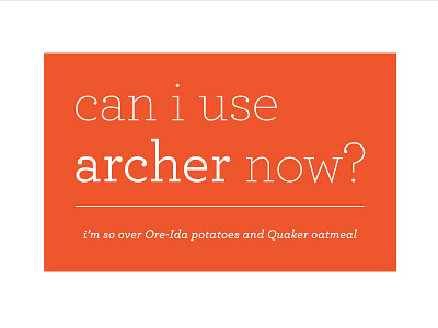
And then . . . . Archer made its way into the hands of 70% of the designers in America and it was EVERYWHERE. I surrendered on the frozen food aisle of the grocery store one day upon spotting it on all of the Ore-ida potato bags.
And then you were scared to use it – scared to look like a copy-cat incapable of coming up with your own fresh ideas.
Well, I for one am tired of feeling ashamed to use Archer. I'm working on a book that needs Archer. It needs the "sweet but not saccharine" serif. I'm taking Archer back – with all of its ball terminal glory.
