INSIDE
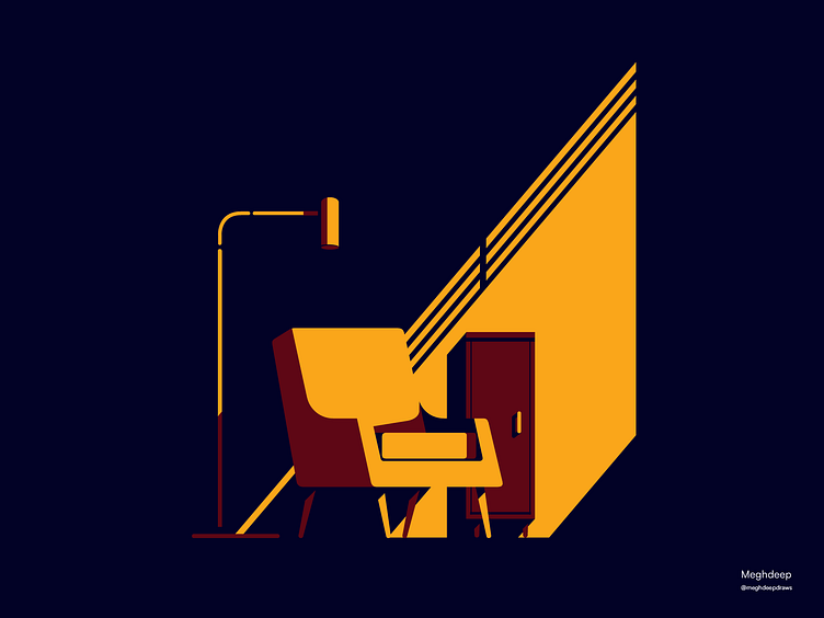
The illustration was meant to uphold the minimal yet a classy interior setup, using limited color, lights and strong shadows. This illustration was specifically developed with the intention of being used in blogs or editorials, particularly for a lifestyle magazine.
Taking on new projects:
Got an idea? Get in touch at meghdeepsarkar25@gmail.com
Also, welcome to my socials: @meghdeepdraws
More by Meghdeep Sarkar View profile
Like
