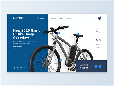
E-Cycle Website UI
Hey all,
My love for running and cycling is endless. But due to the fact that I travel a lot, I often have to rent a bike to explore the city I visit, and I know from my own experience how strange and unattractive some bike rental apps look. And imagine my delight when a client approached me with a request to make a design for such an application.And with the permission of the client, I present to you one of the concepts. While the application is under development, I was so eager to share this with you that I improved it a little and presented it to you.How do you like this presentation and UI design? Press “L” and drop me a comment - let’s discuss.
Design — Figma
Illustration — Adobe Illustrator
************
Download Source File from : Download
************
🖤 And don't forget to show us some love with "Like". Thanks!
************
Do you want to design such creative app for you? Feel free to get in touch with me : Email or Skype
************
Don’t forget to show me some love by following me on : Behance | Dribbble | Linked In | Uplabs | Portfolio
