Retirement planner
Hey folks!
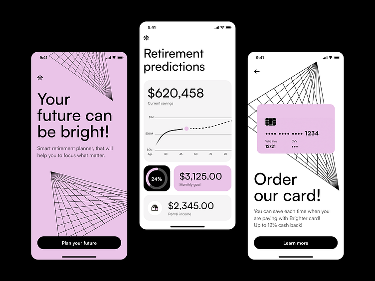
A third shot from the series – the same product but with a different theme. Today's style is based on one strong color - pink 🦩 combined with high-contrast geometric elements that create an edgy vibe.
You can find here 2 previous shots that I was exploring, with completely different style:
As designers, we sometimes work for a few different clients from the same sector. We can struggle with how to differentiate the visual style for each new product that we are working on. By creating a unique look and feel for the brand and the digital product you can stand out and differentiate from the competition in the market. It could help you to create a statement that is behind your brand and make your brand more memorable.
Stay tuned, it's not over!
We're available for new projects! Drop us a line at ux@netguru.com.
—
Show us love! Press "L".
Want to see more projects? Visit our profile or Netguru.com and remember to follow us!
