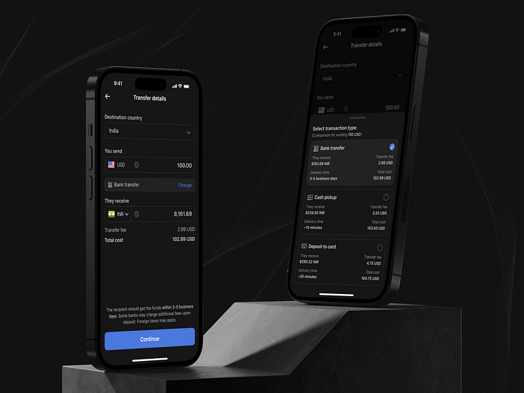
Remittances SDK - Transfer details
Original shots form the other day were 'vanilla'/white label version for SDK. Here, for the dark mode, I tweaked things more to my liking.
I also tried to add some sort of indication for $ comparison to help quickly identify the most optimal price/rate/delivery time. I don't like to rely on color only, even if it's a kind of an 'extra feature' and the dots don't feel obvious enough. Without testing, neither seems good enough for prod.
------
Feedback, especially negative, always welcome!
More by Peter Grochowski View profile
Like


