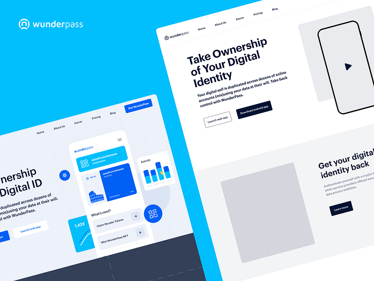
WunderPass – Landing Page UX/UI
Hello everyone!
Today we present the progress from the UX version to the UI design. While creating the wireframe, we focused mostly on prioritizing information. What information is primary to users when they come to our landing page? The most important thing to start with is to explain what WunderPass is and what it's for, as well as the benefits of the WunderNFT. However, it was necessary to include the user persona in this whole story in order to explain to the users that WunderPass is intended for everyone, not just crypto natives. One of the strongest assets of WunderPass is their large ecosystem and the ability to join groups for communication, updates and information exchange. That is why we have included this section as important and highlighted it with a great illustration. Of course, at the end we added the most important CTA section, which we complemented with interesting illustrations and bright turquoise color that draws attention.
Check our website at www.bazen.agency.
You may follow us on Instagram/Facebook/Youtube/LinkedIn/Behance.


