Coffee Infographic
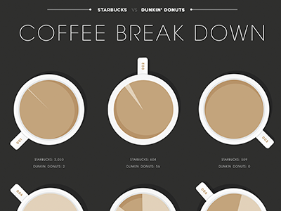
I created an infographic that took the top ten states with the most Starbucks chains and compared them to their competitor Dunkin' Donuts. The coffee in the mugs represent the pie charts that show the difference between the two chains.
More by Ashley Wirsing View profile
Like
