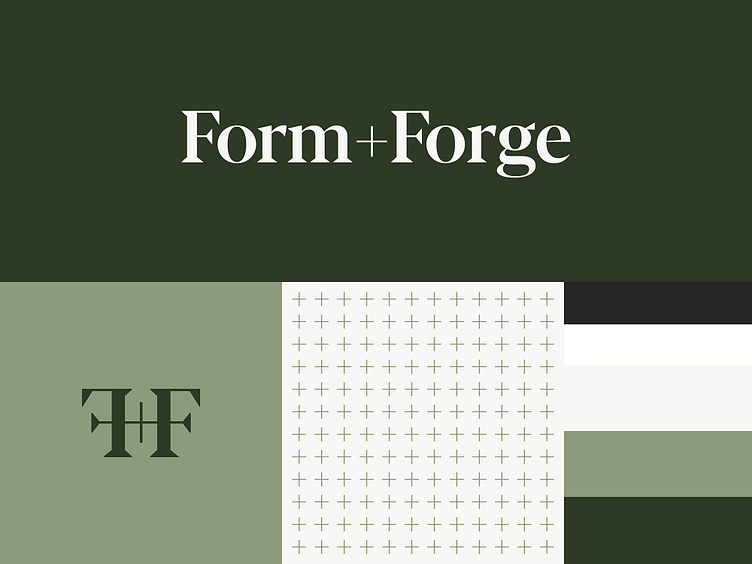
Form+Forge Identity
An identity for a construction and interior design company.
A supporting icon created from the capital "F"s of the Form+Forge wordmark. The "F"s are opposing and connected at the arms by the plus symbol creating a symmetrical icon.
A supporting pattern was created from the plus symbol. The grid it creates ties into the precision and order that is required in construction and design.
The brand guidelines created for Form+Forge that breaks down the color palette, typography styles, and logo use scenarios.
More by Untitled Era View profile
Like


