HBM Case Study
The client
With an in-house research & development, manufacturing and quality assurance, HBM produces high-end health & beauty products. Led by two passionate brothers, HBM supports its clients from concept to commercialization, across a wide range of health and beauty product categories.
HBM Visual Identity
HBM was looking to build a strong, corporate, and scalable brand which will serve as an essential piece in their efforts to position themselves as a stable reliable manufacturing partner in a highly competitive niche.
To capture niche opportunities and uniquely position HBM as a new player on the market, our research consisted of thoroughly dissecting brands of the largest niche players across several systems: online presence, visual and written communication, and color distribution.
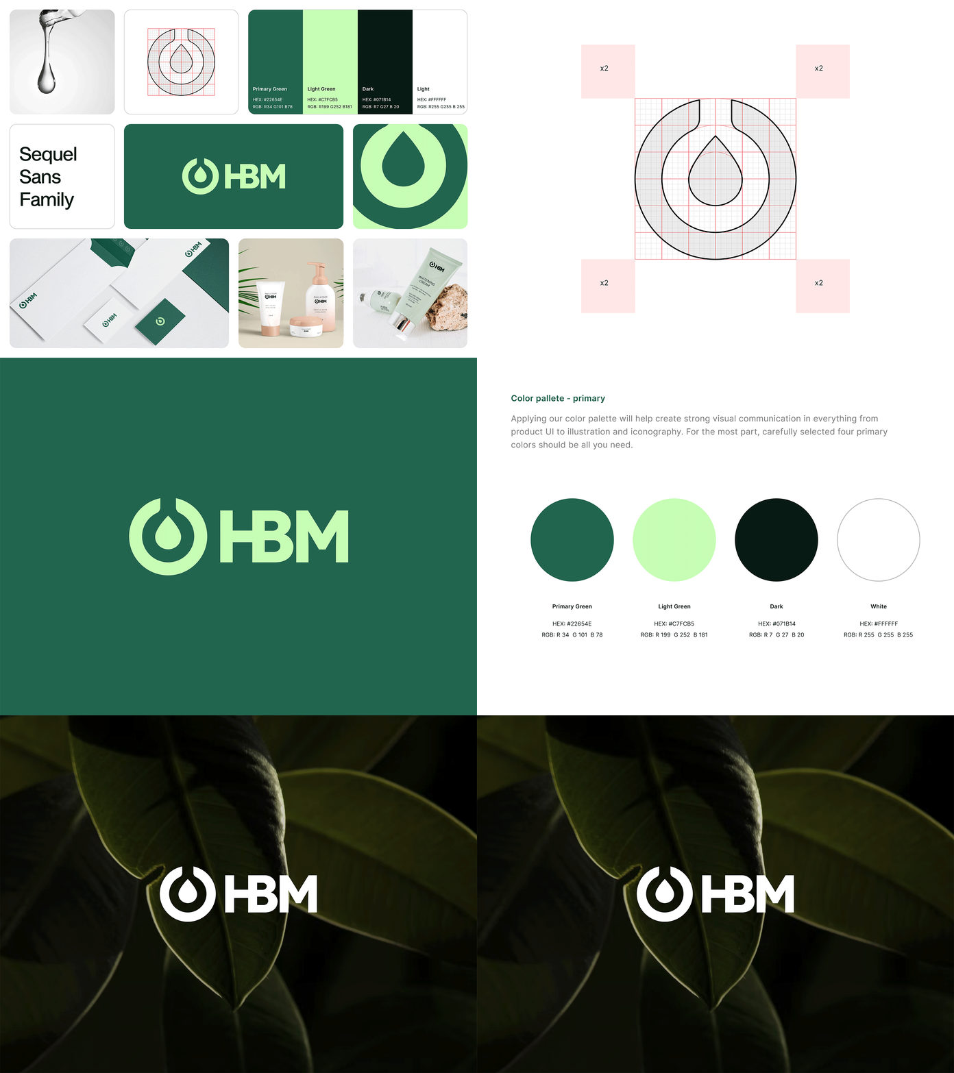
Having research as a dependable foundation, at the core of the brand is a logomark that rigorously captures the essence of the manufacturing process — baker and supplement drop. The wordmark fuses the letters H and B into one (hence, the Health & Beauty part of the name), suggesting the comprehensive nature of the products. Both logomark and wordmark are wrapped in natural primary colors. While primary colors emphasize the health aspects of production, the extended color palette more directly showcases the majority of colors seen in their products.
--
Let’s discuss your next project.
— WE MAKE THE NEW.


