BooWreck restaurant
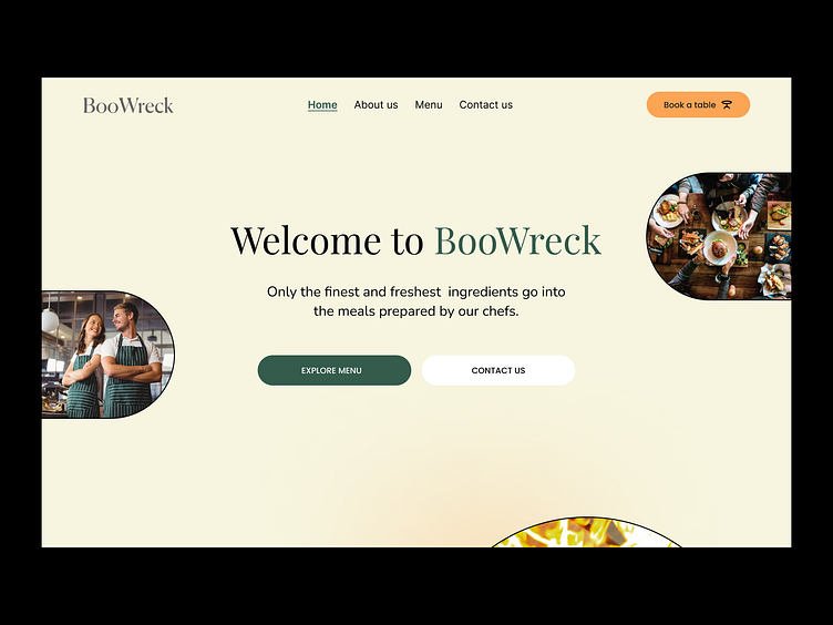
The client wanted a restaurant website that conveys their brand keywords: natural, warm, colorful and relaxed. The copy is also relevant here because they wanted to sound approachable.
We use a serif font for titles, and a sans serif for content legibility. We use strong colours mostly as accents, and we let the high contrast of content, background and images tell the restaurant story.
We wanted to showcase and center the most important information: food.
More by RUBICON View profile
Like


