Simple minimal branding for historical research campaign
Pithy works on projects of all sizes and looks to make an impact where it can no matter the budget. Here Before Us was a prime example of this and made effective use of the time with a simple logo concept that was selected from two initial options and used as the final branding element. This allowed the extra resource to be used across collateral and other marketing items.
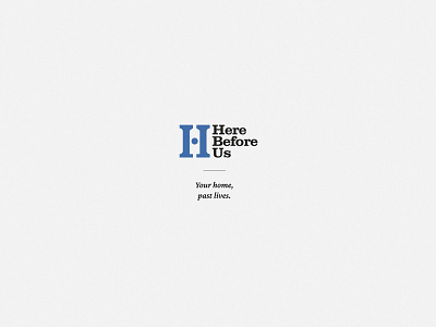
The core logo that was selected features a 'H' as the main logo mark that has the negative space of a house in the middle and a blue plaque as the crossbar. This helps represent what the company does and is a clear identifier for the brand.
If you have a similar project you'd like help with reach out today for a free consultation.