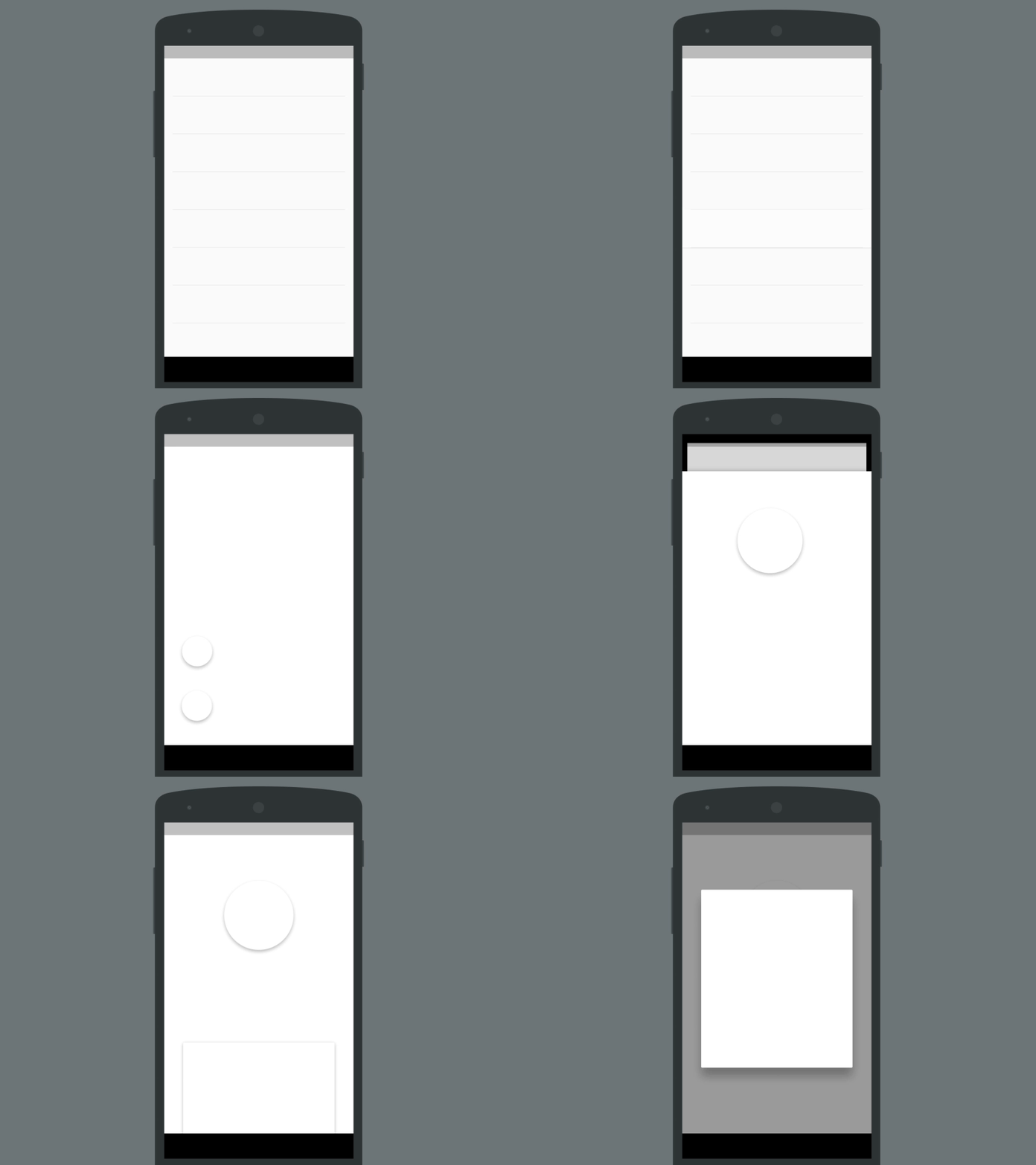
Progressive Hierarchy
UI animations are by far the best way to smoothly change between different contexts within an app. Animations make up the hierarchy of the app, keeping the user unconsciously informed about their current position in it. In Android Lollipop we saw a massive upgrade of animation APIs, making the experience that much better.
The illusion of elevation helps the user create a 3D model of the app which contributes greatly on the perceived context as they navigate an "imaginary" surface where objects rest or float (cognitive model), while the elevation is directly linked with importance (higher elevation, higher importance).
There are some cases in Material Design, though, where the former ignores the latter. Take Google Play Games for instance. Animations are all over the place, but there's minimal change in elevation. It feels like the objects are being reordered in the screen, and thus the sense of hierarchy is lost.
So, to fix that, this is what I have in mind. Objects travel through the screen to maintain continuity and smoothly transition the context, while the background "sinks", giving the sense that we're getting deeper in the hierarchy of the app. Thus "progressive hierarchy".
I can see 2 flaws of this concept at the moment:
1. There might not be enough z space in the phone to allow such movement (according to Material Design spec)
2. It might be mistaken with the animation of switching from one app to another, such as when you press a link (from original app to browser app)
Let me know what you think!
