Docs Homepage Refresh
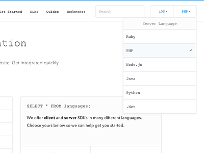
We recently launched an updated developer documentation homepage.
Our goal was to make the page more useful by providing better calls to action, and more jumping off points to get people into the content. We also cleaned up a lot of the UI (removing icons in favor of text to increase clarity) and sprinkled in our custom monospace font throughout the content. We are also working on reducing the amount of text and duplication throughout the rest of the docs to make the experience of integration MUCH nicer.
ᕕ( ᐛ )ᕗ
Check it out! https://developers.braintreepayments.com/
More by Braintree View profile
Like

