DPMS Tix
Branding for Sports Ticketing App
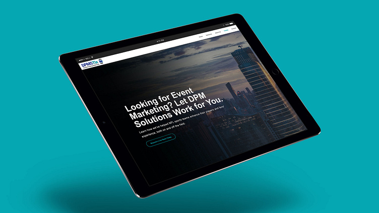
Our client had recently launched a new ticketing app, in partnership with Ticketmaster®, and was in need of a brand identity. With a strategy in mind, we designed a new logo and identity system, brand messaging, and a fully responsive SEO-friendly website to promote their new product and target sports teams across the United States to sign up for their advanced operating system.
Project Scope
Brand Strategy / Identity Design / Website Design / Content Strategy
Style Guide
We packaged our client's identity system into a brand style guide, including logo specs, typography, color palette, iconography, and patterns. This guide is used as a reference for internal teams, vendors, and others who are authorized to work with the DPMS Tix brand.
Wireframing
Building a custom website layout begins with information architecture and wireframing. We used this as the visual guide for arranging pages and elements within the website.
UI/UX Design
Once the skeletal framework of the website was built, it was time to design the look and feel of each page, including colors, typography, graphics, and images.
Website Design
We developed an SEO-friendly website to increase online traffic, promote the new ticketing system, and target sports teams across the nation to sign up for the app.
Client Testimonial
We've been using Josh as a contractor since 2016 and he's helped us on a number of design and development projects, including the work he did for DPMSTix. Using a typography approach, Josh designed a logo with vibrant colors and 2-D lettering to stand out from our competitors. The addition of the mobile ticket icon to the logo was a beautiful touch, as it resembles the purchase of a ticket on your mobile device.
Josh also developed a fully responsive website that shows how our app works, through animated graphics. The whole brand identity reflects our company, what we do, and who we serve perfectly. We will continue to use Josh for website maintenance and future design projects. Clokendagger comes highly recommended!
David Erne
President, DPMS Tix™


