Can Packaging Design
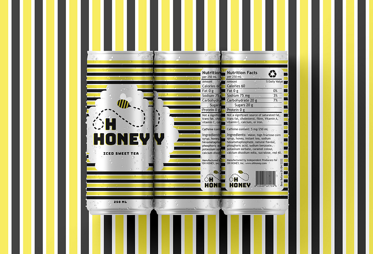
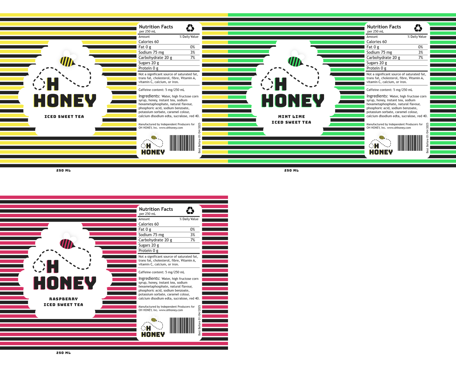
I had a blast coming up with this packaging design for an Iced Tea brand. Playing with bold colours and the raw aluminum can gives this design a modern, fun flare.
Check more out here! --> OH HONEY
The final design embraces the can itself as it plays off of the raw aluminum. It establishes a strong association to bees and honey through the use of straight lines and a primary colour palette of black and yellow. The colours are strong and powerful, but are balanced with the introduction of white space from the raw aluminum of the can. The hive shaped space lets the logo breathe and maintain focus among the eye-catching stripes.
Let's chat! --> emma@emmah.ca
Check more out here! --> OH HONEY
More by Emma Heatherington View profile
Like


