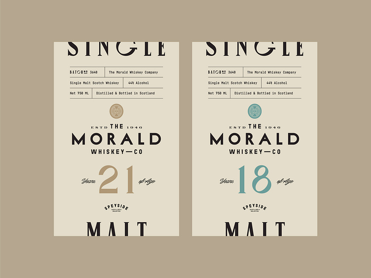
Whiskey Label Design Concepts 🥃
What do you like about this label🧐?
Font combinations are important in alcohol drink label designs🍾, particularly for whiskey🥃. It happens because multiple important points❕ have to be highlighted, and they can't all be done the same way. For instance, the age of the drink is one of the biggest factors that influences the taste and quality of the drink, so we highlighted age with a special colours and increased the size of the font📈.
To increase the uniqueness of the label, we placed the batch, net, and product information at the top of the label☝🏻. Top and bottom parts include serif fonts stating "Single Malt," while for the rest of the label we used sans serif🤓.
Let's work together!
— Do you have a project? 📩 projects@markaworks.com
— Visit our website to see all the project presentations.
