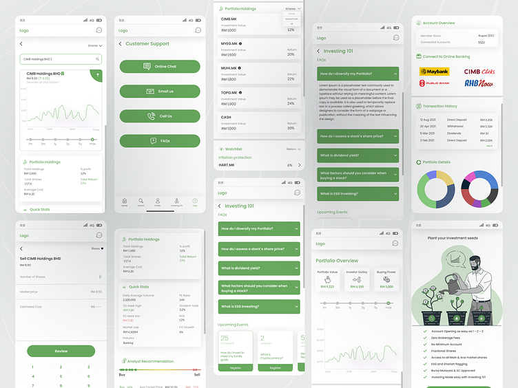
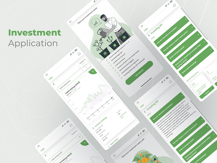
App screens for investment app
Hello,
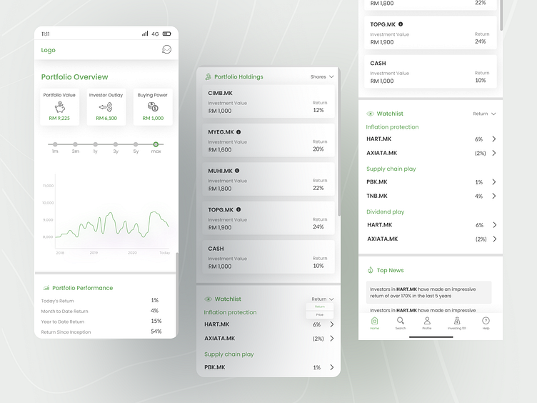
This is an investment app that I designed for a client who wanted to launch the app in Malaysia. The client's goal for this app was to create something that is simple and easy to understand. The target user for the app is the youth who are starting their journey in investment. The app aims to have analysts- all of whom will give their individual reviews on a particular stock and the user can see each analyst's rating and make an informed decision for themselves.
After knowing the brief, I suggested using green colour for the app as green signifies money and growth. Also, because we made a dark theme for the app- green is a colour that pops in dark themes as well. Beyond this, we used simple cards explaining their investment statuses and used very simple graphs and charts so they could pictorially see where their money is at. The idea of making it minimal came from the fact that investment apps can get very overwhelming and I wanted to make sure that it was as less distracting as possible.
The text used in the app is "Poppins" and the primary green used is 68A95E along with the typography black used is 464646.
Hit "L" if you like the design