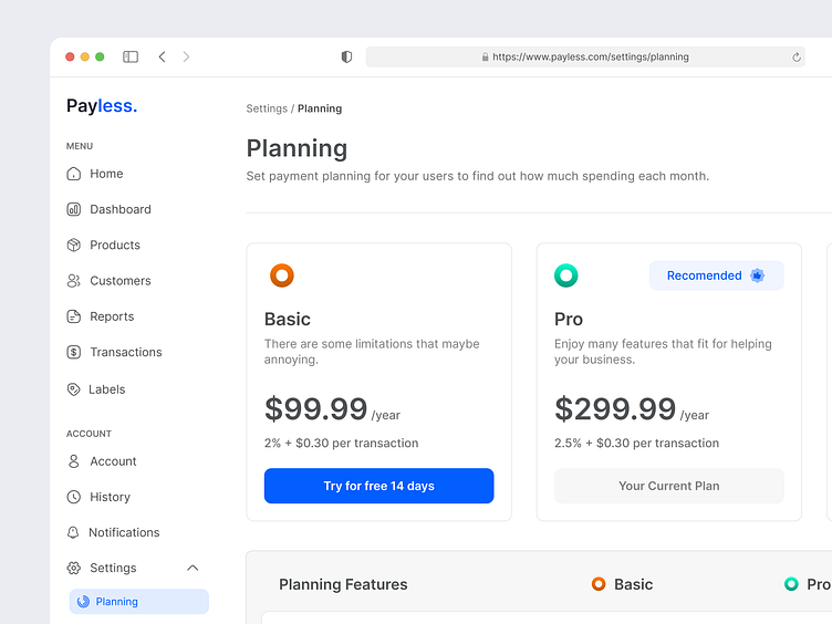
Payless - Planning Page
Hello Dribbble 🔥🔥🔥
Take a look of my latest design exploration, called Payless, a dashboard that could help user manage payment gateways.
On this exploration, I focused my work on the planning page, which is it shows the payment plannings of the product where user can set one of them and enjoys the features that available on each plannings.
I designed this page with considering a UX Law, which is Von Restorff Effect that also called the "Isolation Effect", where I made the Pro Planning more interesting with "Recommended" label so user could be more interested with this planning and could take an action to choose the pro planning.
Let me know what you think!
Feel happy to get some feedback and press (L) if you like it.
Your feedback and appreciation is meaningful for me. Thank you.
-----
Want to collaborate? Shoot your design inquiry to hello@nijaworks.com
-----


