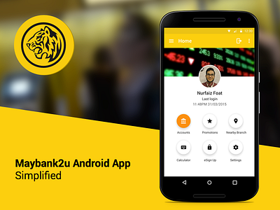
Maybank2u Redesign
At last I managed to allocate some of my time to redesign this. The current Maybank2u app, both iOS and Android are too cluttered with unnecessary info that user actually don't really need at all.
This concept is designed with the basic goals in mind for what banking apps should really be, which are; Check Balance, Transfer Payment and Make Payment.
See it big in Behance
More by Nurfaiz Foat View profile
Like
