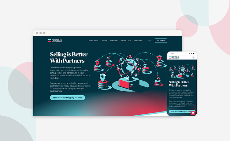
Crossbeam Website Redesign
The marketing and product team, along with the in-house designer at Crossbeam teamed up with myself and the Flickerbox team to bring a whole new approach to the Crossbeam website. New page layouts, modules, icons, and illustrations were integrated into the project to bring the concept of connectivity to life. Both design teams collaborated to incorporate the rich illustrative style of the previous brand into a more open and modern site structure.
You can check out the full site here: https://www.crossbeam.com/
Brand Elements
New site illustrations done by Nick Beaulieu at Crossbeam
Site Pages and Modules
More by Jeffrey Boese View profile
Like


