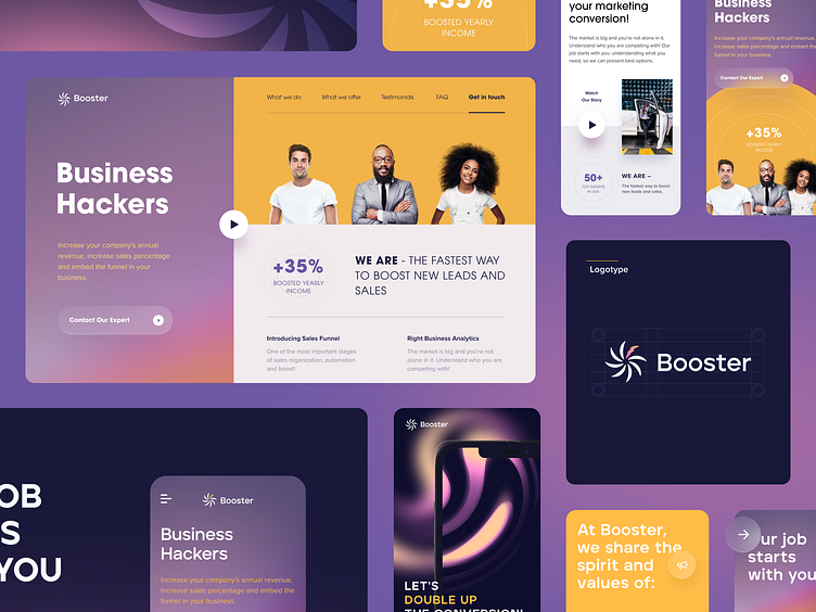
Booster - SaaS for Sales Teams
Mr. Booster is a company with the best experts from the USA. They offer the newest ways to increase leads and sales.
Task
The task was to research competitors in design, understand the company's audience psychology and customer journey map, and create design user scenarios. Based on the data obtained, develop a visually explosive website with a clear structure and correctly applied CTAs.
Solution
We started the design development by studying the target users and their needs. Based on the analysis, we developed several color schemes and application structures and chose the solution after a detailed discussion with the team. Specially, we would like to tell you about the logo. It resembles an engine, which symbolizes reliability, durability, and hard work. All that the client expects from an expert in sales. There is a light yellow associated with contact and an empathic attitude. The selection of photos also emphasizes client orientation. They show what the company is. Mr. Booster is your friend and assistant.
Result
The result is stylish branding that conveys the company's values and a user-friendly, attractive website. The visual identity and information on the website prove that Mr. Booster is trustworthy.


