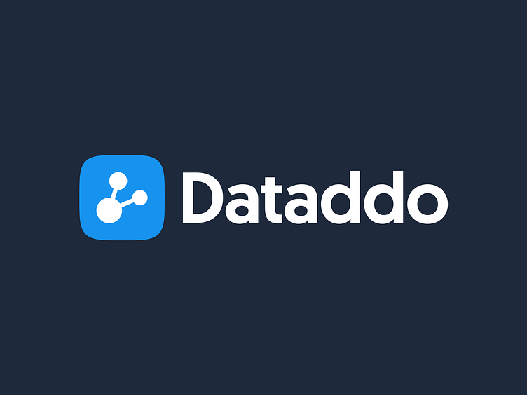
Dataddo Brand Logo Redesign & Guidelines
Why the Redesign?
With the scope of our needs and endeavors rapidly changing, we knew we needed a new logo that could better represent what we do and who we are. We particularly wanted something to communicate the strength and confidence of the Dataddo vision.
One Shape to Rule Them All
Sometimes things just happen naturally. As we built our virtual presence, we started to realize that the most dominant shape that shows up in all of our visuals was a square with rounded corners.
Evolution Over Revolution
Using this dominant shape and the chart symbol from our previous logo, we set out for the missing piece: something that wouldn’t change the main idea of Dataddo, but better present the overarching concept of our service. The chart from our old logo wasn’t aligned with what we do, and we wanted to symbolize the central activity of the company — connecting services.
Main Components
Three dots represent the key components of Dataddo platform: source, flow, and destination. Connecting these three elements allows you to send data to and from anywhere you need.
Consistent Branding
The Dataddo ecosystem contains more than just our main website and app. There are several branches beneath the Dataddo umbrella which we should present as a unified company with a consistent style.


