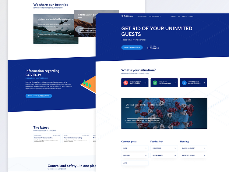
Anticimex Website
Hello, Dribbblers 👋🏀
Here we present a compressed part of the project. Hope it can inspire you
Read more about the project here 👓
Anticimex is a modern pest control company originally from Sweden, but present in several countries. The company is your best friend if you have gotten uninvited pests and bugs into your home.
About the project
Together with the client, we aimed to make the website more intuitive and easy to navigate. Also, making the site searchable (SEO) and maintaining high performance were key topics from a strategic point of view. The overall goal was to:
Streamlining the brand throughout all markets
Creating a more welcoming feeling on the website
Increasing conversion
Maintaining high performance, as the business operates in a field where time is critical, the site and the contact forms need to be up and running all the time.
Challenges
Creating a solution that would make it easy for editors to keep the brand streamlined, but still room for local creativity
Our role
Design
Technical implementation
Strategy
Hosting
Support
Solution/platform
We decided to use headless CMS
Sanity CMS
Gatsby
Care to collaborate with us? 🙏
Talk with us at: info@tedgustaf.com | Instagram: @tedgustaf


