UX design for tablet - Virtual Real Estate
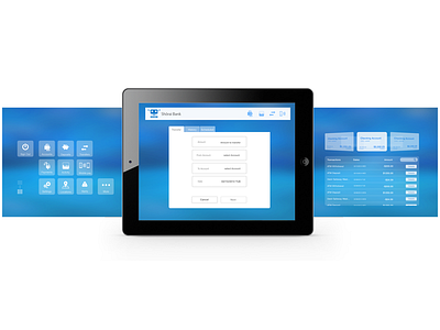
This is a mobile banking application concept that I designed last year.
I wanted to create more real estate by designing two virtual screens on each side of the tablet.
The concept:
VIRTUAL REAL ESTATE
Since mobile users get more and more familiar with slider menus, popups and other hidden UI elements, we can easily imagine more content being hidden from the main view to leave more screen space available.
For instance, these two screens remain consistent throughout the app, only the content in the middle screen changes, depending on what the user is doing (transfer, payments...).
To be able to share these designs, I had to removed part of the navigation and replace the bank name / logo with a fictif one.
Let me know what you think of this concept.


