S T A A T
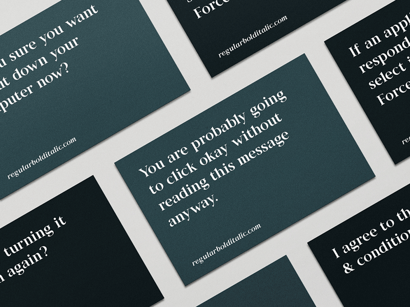


Lately I've been working on my latest font called Staat. Its' a high-contrast serif with sharp cuts at the terminals and pointy serifs. Therefore it has a modern look and strong characteristics.
We released it yesterday, more info at: http://www.regularbolditalic.com/fonts/staat