Apecs User Experience / Interface

The initial goal was a visual update to a more modern look and adding some "premium" feel as this brand is positioned at a higher end (the company has specialized brands positioned at a lower end). The research (interviews) showed that the target audience (dealership and architectural agencies) is mostly using the website for product discovery and making order lists (the company does not sell its products directly). After learning that, I proposed to add some initially missing features, such as dealer availability check, finishes gallery and the ability to make "favorites" list.
One of the main UI challenges was to keep all the menus and filters which the target audience might need but achieve that "minimal" interface look to better showcase the products themselves. The chosen solution was to use the "sticky" scroll effect where the most important interface elements would be kept on the screen while the secondary elements (such as page header, second-level navigation etc.) would be scrolled away.
The effect (prototype) in action:
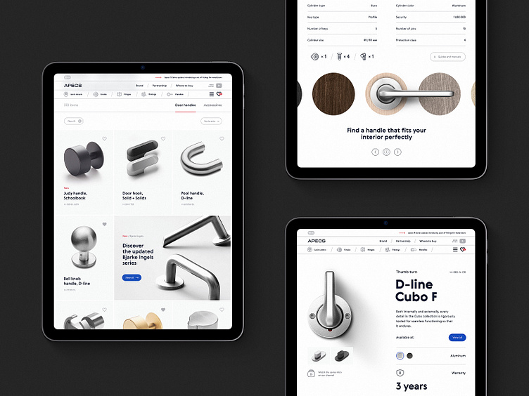
Product page example
Note the product gallery staying in place on scroll. This also shows the finishes gallery and another subtle effect which was added -- animated "light source" (moving shadow).
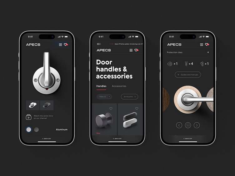
Smaller viewports (also dark mode, yaaay):
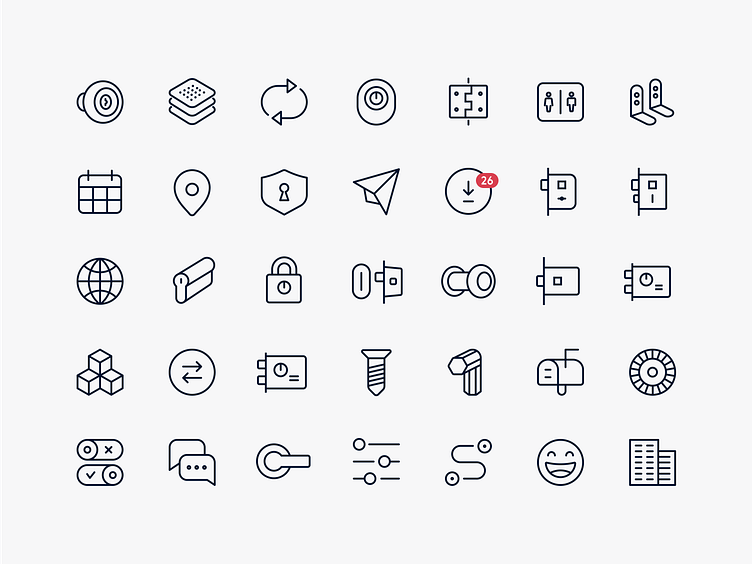
As part of this project I also designed a new icon set (based on existing one, which was redrawn) and a design system / component library.