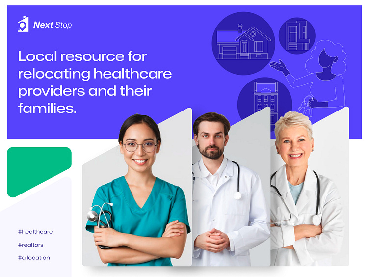
Branding for Next Stop - relocation app
Hi there!
Today we want to show you the branding for Next Stop, a relocation app for physicians and their families. Basically, we tried to make the platform efficient and simple. Thus, we shifted to a minimalistic UI, emphasizing the essential elements with simple colors and rounded element shapes. Then, we replaced text blocks with informative illustrations that help users to figure out their next steps effortlessly.
The platform’s UX was reworked too. We added a simple navigation panel, subscriptions, and interactive banners that help users get acquainted with the platform. Share your thoughts, please.
Made with love at Fulcrum ❤️
Need designs for your idea?
🚀 Visit our website: https://fulcrum.rocks/
✉️ Drop a line at hello@fulcrum.rocks
More by Fulcrum Rocks View profile
Like
