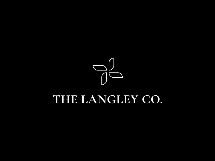
The Langley Co. Logo
The goal of this project was to create a logo that is welcoming, feminine, sustainable, and minimal for a local handmade jewelry business that was expanding into a boutique.
The final logo displays two L’s flipped vertically, that are made of shapes that resemble leaves. This logo is paired with a serif font called Cormorant Garamond, giving it a feminine and high quality look.
More by Sam Wilks View profile
Like


