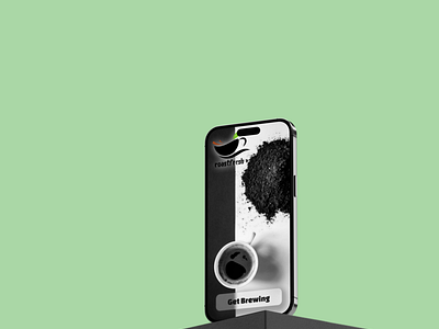
Daily UI Challenge #003 - Landing Screen
I'm still working on the glass look for buttons, this was the best one I've made yet and I wanted to be sure to have it in this design. I like the two tone look for landing screens and this had a nice asymmetrical split to it.
More by Daniel Murtha View profile
Like
