Landing Page Rebrand // Polished Geek
A whimsical refresh for one of our favorite clients
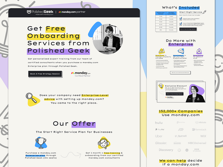
Don't let the bright colors, large headlines, and hand-drawn icons fool you—Polished Geek is all business. In fact, their business is helping your business do business better.
While their previous branding was sleek and professional, this new branding is the right step into future project management consulting. This project needed to balance fun, bubbly branding with the professionalism of Polished Geek's work and credentials. This project allowed us to explore the new look and feel of Polished Geek and give them some layout inspiration to consider while they update the rest of their site.
More by Linear Design View profile
Like


