Foot Locker
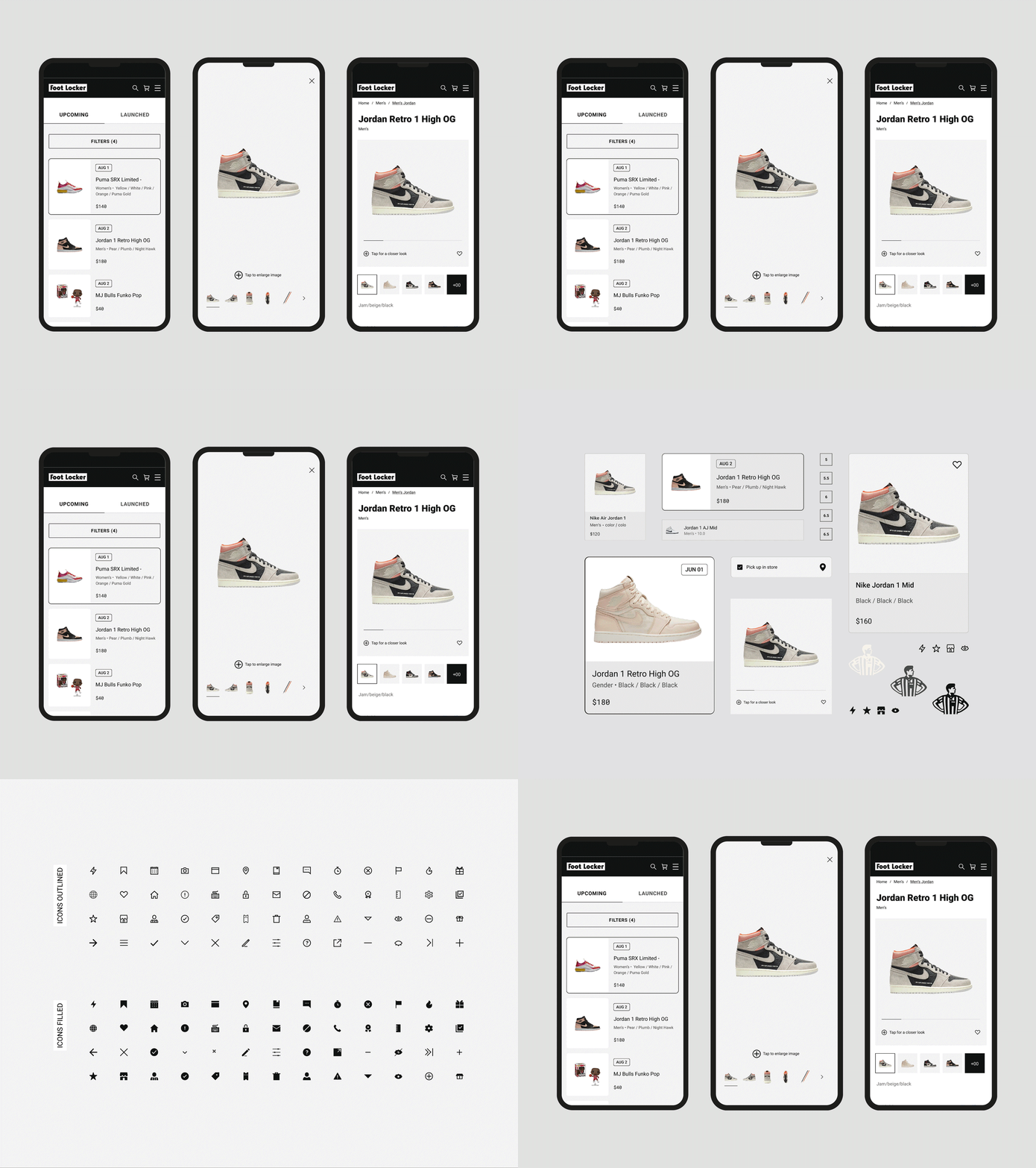
We all know Foot Locker, so working with the FL was always going to be a fun challenge. This project specifically focuses on our team’s redesign of the product details page.
⤵
Have a project in mind? Let's get to work!
The Challenge
The project's primary goal was to improve the performance of the product details page for the Foot Locker suite of products. Focusing on improved conversion rates and decreasing page drop off we set off.
The Solution
Collaborating with our data and research teams, we were able to highlight key points of emphasis for improvement. After extensive user testing, we rolled out a plan for a/b testing and further design improvements.
Results
After 6 months of close collaboration, our product team at Foot Locker launched a much improved product details page. In addition to the website, we defined a new design system around the (then new) branding, typography, and components. Below is a quick snapshot of the improved numbers.
Results Thus Far:
16.68% Decrease in Page Exit Rate
26% Increase in Conversion
Adapting for ADA
One of the primary objectives for any designer at Foot Locker is to ensure that all of our experiences are accessible for all users, including: mouse, trackpad, touch, keyboard and voice. See below for our list on how we improved our compliance:
1. Clear, concise copy and alt-text Left and right navigation arrows within the main product image that appear on tab only.
2. Toast messaging within the modal for keyboard users, Ability to zoom in and out by keyboard users
3. Color contrast and legibility compliance
4. Regular collaborative reviews with our ADA architect
Credits:
Fulbright, Josh Paris, Megan Norman
For more information about Foot Locker projects including our iOS & Android redesign. Drop me a line - design.colinbaker@gmail.com


