Online Supplement Store
Hello friends! 👋🏼
New day, new concept. We've already shown this project, but it's so big that it's impossible to fit everything in one shot! You can find the first part in our profile.
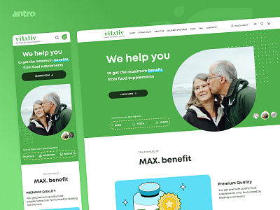
This time we want to show the main screen. It conveys to the user care, calmness and confidence that here they will help him become healthier!
In an online store, it is important to show someone else's user experience so that the user is convinced of the quality of the product.
On the second screen, you can see the feedback block. And on the third screen, the product catalog. We tried to make it interesting and bright, but without forgetting about the ease of use!
What’s your opinion about it? Support us and press "L" if you like it! ✨
We're available for the new projects
Follow us


