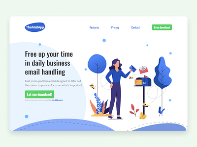
UX/UI Design of a website Hero Section
Hello!
So i would like to share with you with my design of a hero section at made up landing page that is promoting an email app.
The idea was to create a trustworthy first impression and feel of relief.
In heading and subheading i used the positive framing and value promise.
For the main CTA i've used 1st person callout and microcopy to ensure users that app is gladly used by others.
More by Jarek View profile
Like
