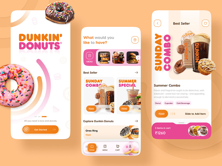
Dunkin Donuts App Case Study
Today, We are here with a Conceptual Design of the Dunkin Donuts App.
Dunkin Donuts is an American global coffee and donut organization, and fast-service cafe, Which has its own application. It appears to be obsolete from the perspective of UX/UI. So we have attempted to apply modern design ideas to make viable interactions with users and made the customer experience better.
Color Scheme
The color variety which is used in this plan is Pumpkin Orange and Raspberry Pink. This tone is inspired by the official theme of the application.
Typography
We have picked the typography style as shown by the fundamental text styles of the DUNKIN DONUT App.
So, Enjoy the UI and let us know your thoughts in the comment section.
Press "L" if you like ❤️ it.
Know more about us. Contact Us


