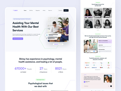
Shinsy - Psychology Consultation Landing Page
Hello Friends!!👋
Today I want to share my latest exploration about psychology and mental health consultant called Shinsy. In this exploration I don't really make any exclusive layout but still has compact content in it with the harmony of the color green, purple, peach and grey blue that make it bring and feels safe, emotional, calm but also make it looks professional.
For the branding only make from the icon that represent mental health (symbol). Shinsy made from two words "Shin" and "Sy" from psychology. Shin is word clip from "Seishin" merge in into word Shisy.
Any comments or suggestions? Let me know your thought!
Leave a like if you like this design, Thank You!!
We are available for new projects
📪 Email: hello@vektora.studio
🎯 Skype: Keep in touch 😀
🌐 Website : Vektora.studio
👋 Instagram: Vektora.studio
🛍️ Ui8: Vektora Shop
💰Gumroad: Vektora Gumroad
🏄♀️ Behance: Vektora Behance


